Creating a Dashboard
The UTMStack Dashboard provides a flexible and intuitive interface for visualizing and analyzing your data. The process of creating a new dashboard involves selecting and configuring visualizations based on your specific needs.
Visualization Menu
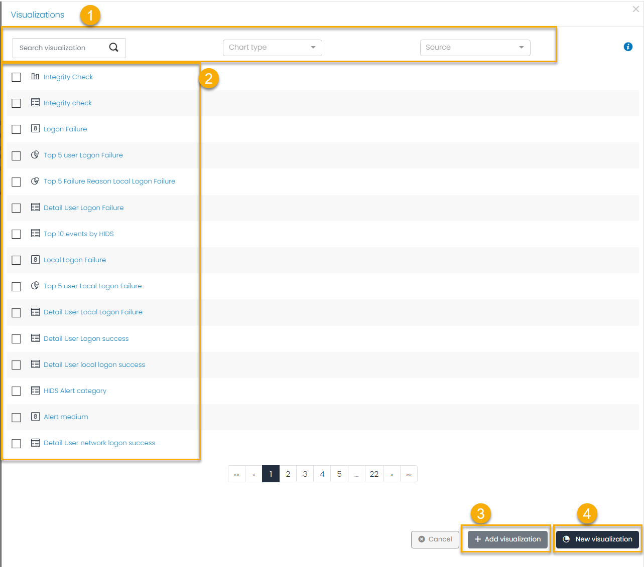
This is the Visualization Menu, where you can see and add new visualizations to your dashboard.
This has the following parts:
-
Filter Visualizations Before adding visualizations to your dashboard, you may want to filter them based on specific criteria:
- Visualization Name: If you know the name of the visualization you want, input it here.
- Chart Type: If you’re interested in specific chart types (e.g., bar, pie, line), filter by this category.
- Source: If your visualization depends on a specific data source, use this filter.
These filters help you quickly find the exact visualizations you need.
-
Visualizations List Review the list of visualizations based on your filtered criteria. Choose the visualizations you want to include in your dashboard. Remember, you can select multiple visualizations to provide various data views.
-
Add Visualizations Click the Add Visualizations button to add the selected visualizations to your dashboard. You will then be directed to the dashboard editor.
-
Create New Visualization If you need a custom visualization that’s not in the list, use the New Visualization button. This action will open the Visualization Editor, where you can create a custom visualization from scratch.
To see how to create a a visualization go to Link
- Configure and Save Dashboard In the dashboard editor, you can arrange, resize, and modify the visualizations as needed. Once you’re satisfied with the layout, give your dashboard a unique name, an optional description, and save it for future use.
By following these steps, you can create custom, insightful dashboards to analyze and visualize your data effectively with UTMStack.
Dashboard Editor
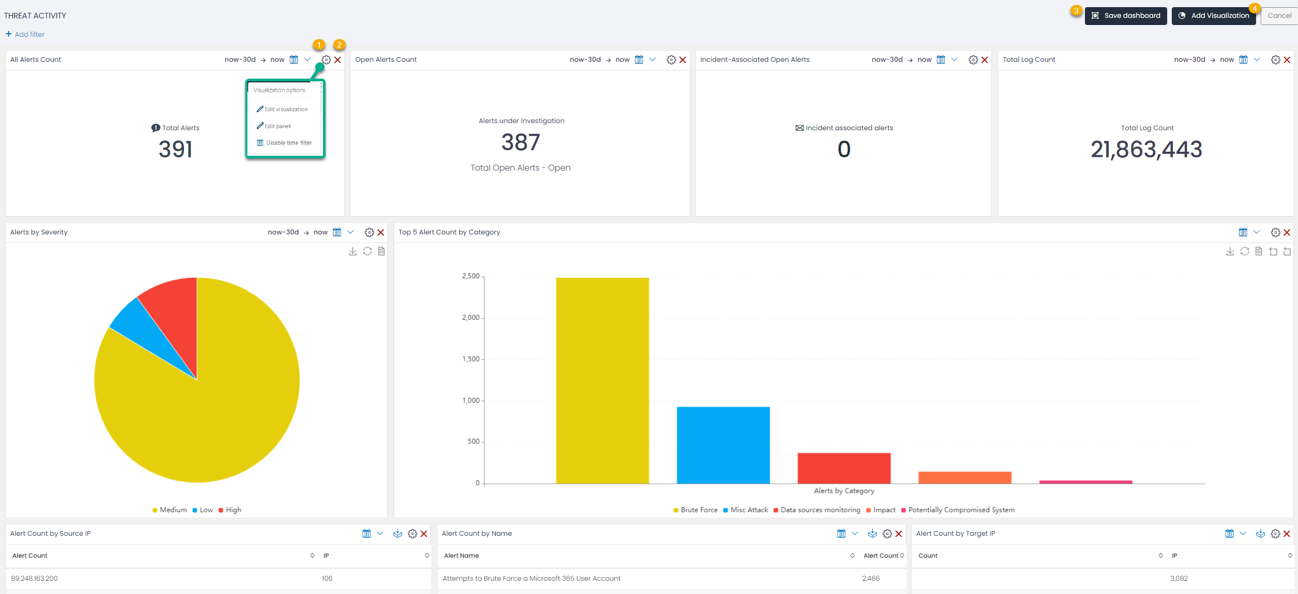
Each visualization on your dashboard comes with a set of options:
- Visualization Options
- Edit Visualization: This option allows you to modify the selected visualization’s parameters directly from the dashboard. The visualization builder provides a variety of tools to manipulate your data for more accurate representation.
-
Edit Panel: This option lets you change the name of the visualization panel. An appropriate name can make it easier to understand the visualization’s purpose at a glance.
-
Disable/Enable Time Filter: This option lets you enable or disable the time filter for the specific visualization. It can be helpful when you need a visualization to display data from a different time range than the dashboard’s global time filter.
- Delete Visualization The delete option allows you to remove any unwanted visualization from your dashboard.
Resize and Reposition Visualizations Each visualization in your dashboard can be resized and repositioned to best fit your needs. Click and drag the lower right corner of a visualization to resize it, or click and drag the visualization’s title bar to reposition it.
Add Filter Use the Add Filter option to narrow down the data displayed in your visualizations. This can be particularly useful when you want to filter specific fields of your datasource.
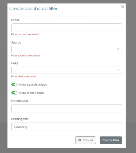
When creating a filter, you can define various parameters:
- Label: Provide a name for your filter for easy identification.
- Source: Select the index pattern that the filter will apply to.
- Field: Select the specific field within the chosen index pattern.
- Allow Search Values: Enable this option to allow users to search for specific values within the field.
- Allow Clear Values: Enable this option to allow users to clear the selected values.
- Placeholder: Provide a placeholder text to be displayed when no value is selected.
- Loading Text: Specify the text displayed while the filter loads data.
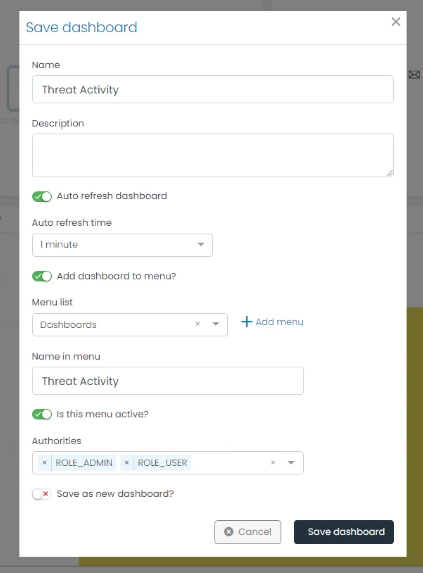
- Save Dashboard
After creating and arranging your visualizations in the Dashboard Editor, it’s time to save your work. UTMStack provides a variety of saving options to best accommodate your needs.
-
Name: Provide a unique name for your dashboard. This name will help identify your dashboard in the list of available dashboards.
-
Description: Add a brief description of your dashboard. This should include information about the dashboard’s purpose, the type of data it’s presenting, and any other relevant details.
-
Auto Refresh Dashboard: Enable this option if you want your dashboard to automatically update with the latest data at regular intervals.
- Auto Refresh Time: If you have enabled the auto-refresh option, specify the frequency at which the dashboard should refresh.
- Add Dashboard to Menu?: If you want your dashboard to be easily accessible from the main menu, enable this option.
- Menu List: Select in wich menu list you want to add the dashboard, default Dashboards.
-
Name in Menu: If you have chosen to add the dashboard to the menu, specify the name as it should appear in the menu.
-
Is this Menu Active?: Indicate whether the menu containing your dashboard should be active or inactive. An active menu is visible to users, while an inactive one is hidden.
-
Authorities: Specify who has access to this dashboard. You can choose by roles (for example ROLE_ADMIN or ROLE_USER)
- Save as new dashboard?: If you’ve made changes to an existing dashboard but want to keep the original version, check this box to save your work as a new dashboard.
After adjusting these settings to your satisfaction, click “Save” to store your dashboard. Your custom dashboard is now ready for use and can be accessed anytime you need it.